When I found out the major browsers were beginning to include error validation into their support for forms, I was pretty excited.
Form validation is always a fiddly part of accessibility, so I’m always looking out for ways to make it easier for developers to do properly. I read MDN’s form data validation tutorial and a CSS Tricks article on client-side form validation and immediately made some test forms.
Sadly, I was disappointed with the results.
The default error validation in browsers is almost completely inaccessible. I was hoping we’d get default “you’ve forgotten to fill this in” messages that could be customised. I might have been a bit too optimistic! Validation at the browser level has many of the same issues we find at the website level.
How do browsers show validation errors?
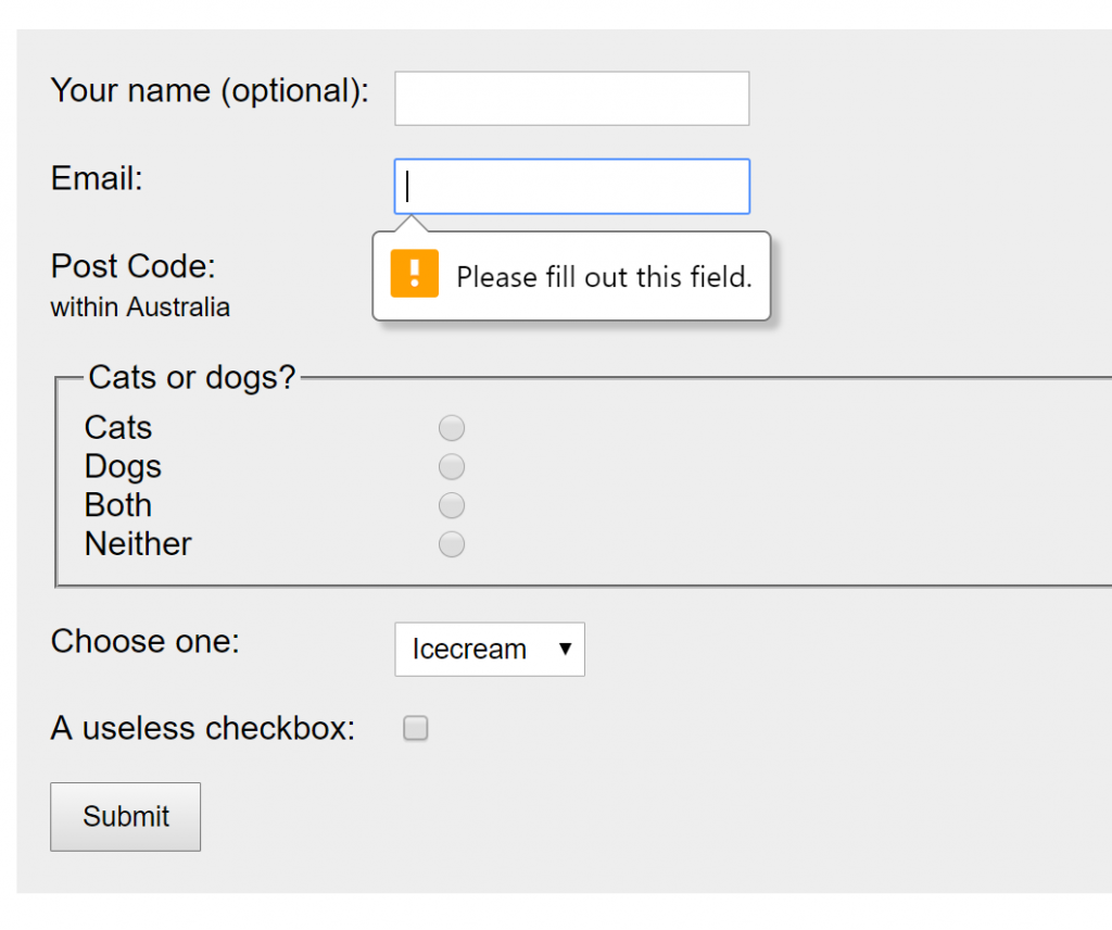
If you haven’t yet had a chance to experiment with the default error messages, I’ve made a little form for you to play with in CodePen. Try to submit the form without entering anything in the fields, and then try it again in other browsers.
See the Pen
Default browser error validation by Julie Grundy (@stringyland)
on CodePen.
What makes these error messages inaccessible?
Contrast
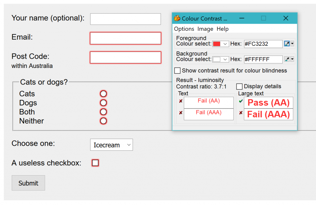
You’ll notice that the colours don’t have a lot of contrast, which makes the messages difficult to see for people with low vision or who are colour blind. You can style this with CSS, using the :valid and :invalid pseudo-classes, if you don’t mind that IE and Edge don’t support that.

Screen readers
What you might not realise is that the text in the messages can’t be reached with a screen reader. The first time I played with these, I was looking for something I could edit in the dev tools, and that’s not actually possible.
These messages seem to be part of the browser itself, not injected to the page. Which is good from a security point of view, but completely prevents people who can’t see the page from even realising that there’s a problem with the form.
Temporary
Another issue is that the messages are temporary. As soon as you put focus on the input with mouse, keyboard or touch, the message disappears. People with cognitive impairments will find it difficult to use these, and I think anyone trying to fill in the form while they’re distracted will have trouble as well. People who rely on the keyboard for navigation (which includes both sighted users and screen reader users) will also lose these messages as they move around the form.
Only the first error is noted with a message. The rest rely on a change of border colour, which is, again, not evident to screen reader users. They’ll end up having to submit the form once for each error, correcting them one at a time.

Generic
The messages are also pretty generic. This is completely understandable, since the browser is guessing at the source of the problem for you. If your input needs a certain pattern, like for email addresses, you can include that as an attribute.
I’ve added a regex formula that matches the Australian post code format to the pattern attribute, as shown below:
<label for="numbers">Post Code:<br> <span>within Australia</span> </label>
<input type="text" id="numbers" required pattern="[0-9]{4}">
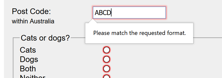
And here’s the new error message, which is more specific than simply “please fill out this field”. Notice though that you still have to tell your users what format you are expecting to find:

A missed opportunity
But for most things more complicated than an empty input, it’s a missed opportunity to provide useful help. You can override the default message using JavaScript, with the setCustomValidity method on inputs. But if I’m going to be using JavaScript for that, I might as well make my own custom error messaging and make it fully accessible in the first place.
On the whole, the validation part of these error messages is pretty good for the basics like email and text. The JavaScript API for them seems useful to me, although I haven’t had a chance to test it in a real-world situation yet. I’d love to hear from anyone who’s tried it already.
But the error messages that are generated by the browser are almost completely inaccessible and I can’t recommend you rely on them at all.
How can we do better?
The solution – for now – is to keep making custom error messages for all our sites.
When we use HTML, CSS and JavaScript, we can make error messages that have strong contrast, can be reached with a keyboard and are announced by screen readers, and will persist until the user fixes the error.
This also gives us a chance to provide useful help in complicated forms, and maybe even a little branding or tone to reinforce the vibe of the business. If you’re not sure how to make accessible error messages yet, I highly recommend Russ Weakley’s presentation slides on Accessible Form Hints and Errors, or these guidelines on How To Report Errors in Forms from the Nielsen Norman Group
I’ve noticed in some sites that have accessible error validation the browser default validation is also in place. Most likely this is because the site was built before the browsers added this feature. It doesn’t hurt anything, exactly, but it does make your thoughtful validation look a bit messy and repetitive.
If you’re confident of your error messages, you can remove the browser validation by adding the novalidate attribute to the wrapping form element, like this:
<form novalidate>...</form>
The bottom line
It’s a shame that the validation feature in browsers doesn’t work well for everyone. It would be really useful to have something basic and accessible as a fallback for more customised error messaging (or for websites where the developer hasn’t thought about error accessibility yet).
I’m hoping the browser authors are working on upgrades to make the defaults more accessible, and ideally provide a way for developers to extend them as needed.
It won’t be an easy project, but such a useful one it would be worth investing the time to make it work well for everyone.

