
Ayesha Semfel makes a simple case: the content screen reader users hear is still real content, and it deserves the same care as everything else on the page. Drawing on real audit findings, they walk through the most common ways that content goes wrong, from over-described buttons to untouched placeholder code, and how to fix it.
Screen-reader-only copy deserves the same care as everything else on a website.
A lot of thought goes into writing content for a website. But have you considered the content that only screen reader users will perceive? Things like:
- Text alternatives for images.
- Status messages/ARIA live regions.
- Icon button accessible names (buttons without visible text).
It’s important to remember that on the other end of a screen reader, is a human. So, we should write for them as carefully as we write for anyone else.
This article looks at some of the most common screen reader content issues I see in audits.
Over-describing
It is common to see accessible names which are too descriptive.
I can tell clients are trying to do the right thing by adding more information for screen reader users. But this information can quickly become unnecessary and overly verbose.
Here are some examples:
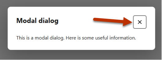
- ‘Select to close’ for a close button.
-
- The role of ‘button’ already tells users that they can activate it for something to happen. ‘Select to…’ is redundant.
-
- ‘Close’ would be enough.
- ‘Back button go to the previous slide.’
-
- This includes the role ‘button’ in the accessible name.
-
- It duplicates information – ‘back’ and ‘previous’.
-
- The actual useful information is buried at the end of the name.
-
- ‘Previous slide’ is a better label.
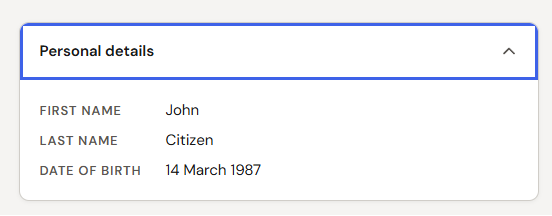
- An accessible name of ‘Collapse personal details’ for an accordion button.
-
- The accessible name is instructing the user rather than describing what the control is.
-
- Assuming this control has aria-expanded applied, when expanded, the full announcement becomes “Collapse personal details, expanded”. This is confusing!
-
- The visible label is adequate – there is no need to add more information!
-
- ‘Personal details’ would be enough. Let aria-expanded do its job.
- A wordy status message. When a user adds an item to cart, “Item quantity updated to 1 in cart.”
-
- This is fine but probably could be more succinct.
-
- “1 item added to cart” would be sufficient.
Just like any other piece of writing:
- Use plain language.
- Be concise. Lead with the most important information.
- Remove redundant words.
And don’t forget:
- Don’t include information in the accessible name that will be conveyed by other roles or attributes.
- If the visible label is sufficient, there is usually no need to add extra information for screen readers!
Not using punctuation
Punctuation helps structure content. It tells us when to pause, helps convey tone, tells us when one idea starts and a new one ends, when a sentence is a question. It can also completely change the meaning of a sentence.
Screen reader users are constantly listening to content. Punctuation is helpful for not only comprehension but also user experience.
Use punctuation for screen reader content. It allows the screen reader to pause at the right moments.
Use full-stops, commas, capital letters, colons, question marks, quotation marks in all your content intended for screen reader users. Just as you would if you were writing visible content!
Content that is not proof-read for typos
It is quite common to find typos in content for screen readers. Typos like “Quensland” instead of “Queensland”. Or “pronounciation” instead of “pronunciation”.
Other examples include:
- Duplicated accessible names so the name announces twice. For example, “First name First name.”
- Code left in an aria-label. For example, “{{window title}}” which is announced by screen readers as “Left brace, left brace, window title, right brace, right brace”.
- Placeholder content which hasn’t been updated. (See above example).
- Code-facing or developer facing names which come straight from the element’s variable or ID in the code. For example, “firstName” or “first-name-id”.
Typos are at best, jarring, at worst, complete gibberish. They’re also sloppy.
It should go without saying that your content for screen readers also need to be checked for spelling mistakes and inconsistencies.
Content that doesn’t make sense
This might sound obvious, but I often come across accessible names which just don’t make sense.
What do you think the button name “New feature indicator Avatar builder Create avatar” means?
Yes, a user could maybe figure it out based on context and position of the component, but we don’t want to make our users think! (For the record, it was profile button in a website header).
Make sure your accessible names and content make sense.
- Use full sentences.
- Read content out loud before publishing if you’re unsure.
What you can do
Notice how some of these examples are not WCAG issues? It’s important to remember that passing WCAG does not necessarily mean your content is usable.
- Use best practice copywriting techniques for ALL your copy.
-
- Refer to your internal style guides.
-
- If you don’t have one, your country’s government style guide is a good starting point. I love the Australian Government Style Guide.
- Use plain language. This goes without saying for all content.
- If you have copywriters – use them.
-
- Get them to review your alternative text, button icon labels, status messages etc.
-
- Come up with reusable content patterns. Make sure you’re using the same language across the site.
Remember that you are writing for humans when you are writing content for screen reader users.