
In the second of the series, Claire Webber, Senior Consultant at Intopia, writes about how we tested the accessibility Skill Chris built for Figma Make and what the results showed.
In the first article, Chris Pigden explained why AI tools produce inaccessible code by default, and walked through the skill we built to make Figma Make prototypes more accessible. This article covers how we tested it, and what we found.
Evaluating an accessibility skill
To evualate our accessibility skill we took a three-pronged approach:
- Comparison benchmarking
- Guerrilla testing with designers
- Usability testing a prototype with assistive technology users
Comparison benchmarking
The first step was to test the impact the skill was having on the code. To do this, we needed to compare the technical accessibility of a prototype generated by Make – both with and without the skill.
To do this we created a series of prototypes, and each one was created twice: first without the skill, and then with the skill applied. From the content of each prototype set, we then wrote extensive accessibility tests that we could use to compare the quality of the outputs.
As each test was a pass or fail case, the results could be directly compared. This enabled us to total the pass and fail cases to achieve a final % pass-rate score.
To ensure results were consistent, all prototypes for comparison benchmarking were generated using Sonnet 4.6. This ensured the same model was being used across all tests.
We chose Sonnet 4.6 as it was good balance between token usage and deeper thinking. Cheaper models like Gemini don’t allow the skill to be applied, and models such as Opus 4.8 used a lot of tokens.
This approach catches most things, but we acknowledge there is room for something to be missed. The goal was to create a comparable benchmark. These are Intopia’s own test results and not independently validated.
Test case example
| Test ID | Success Criteria | Check | Result |
|---|---|---|---|
| 38 | 2.1.1 Keyboard | Drag-and-drop (reorder within lane) has a keyboard-operable alternative | Pass |
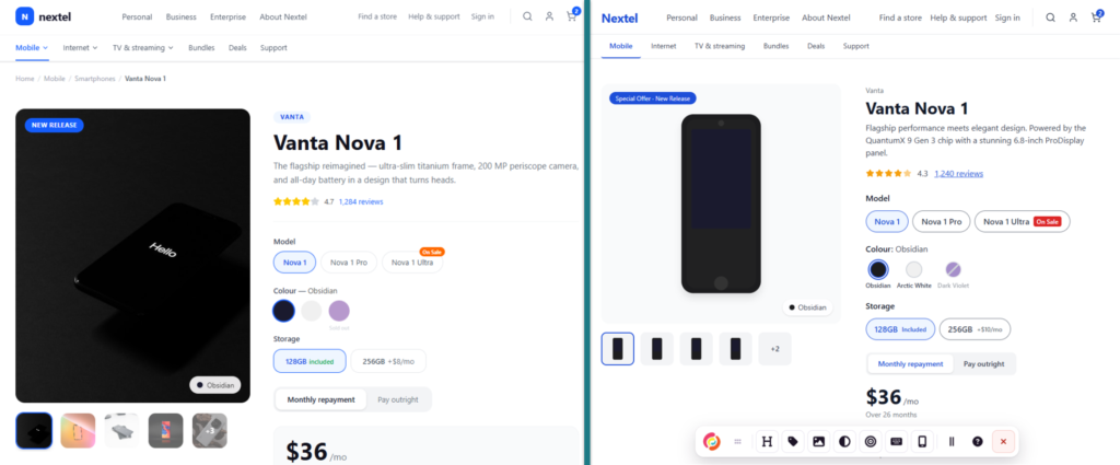
Benchmark 1: Mobile site
For our initial benchmark we generated a mobile product page using a text prompt. The same text prompt was used to generate 3 prototypes without the skill, then 3 prototypes using the skill. All the prototypes were then tested using the accessibility test plan to benchmark the skill.
Results
| Scenario | Page 1 pass rate | Page 2 pass rate | Page 3 pass rate | Average pass rate |
|---|---|---|---|---|
| Baseline | 44.4% | 47.1% | 49.6% | 47.0% |
| Skill guided | 93.7% | 88.6% | 90.9% | 91.1% |
This showed a positive delta of +44 for the skill guided result.
Benchmark 2: Puppy site
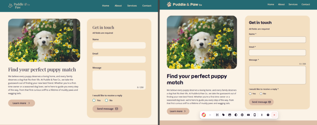
Next we conducted a benchmark creating a prototype directly from a design.
We created a simple site with a hero image, information and a contact form. In the design we introduced some visual design accessibility errors to see how well the skill could correct these common issues.
Results
| Scenario | Average pass rate |
|---|---|
| Baseline | 49.3% |
| Skill guided | 97.3% |
This showed a positive delta of +48 for the skill guided result.
Benchmark 3: Complex tool
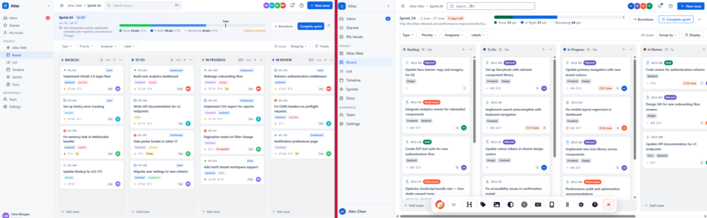
For our next test we wanted to take a big jump up in complexity. How well could the skill handle complex accessibility issues?
From an in-depth text prompt, and utilising the planning mode, we created a kanban web app prototype. This had more complex challenges, such as a complex layout, drag-and-drop functionality, and menus and modals.
Results
| Scenario | Average pass rate |
|---|---|
| Baseline | 24.4% |
| Skill guided | 74.5% |
This showed a positive delta of +50 for the skill guided result.
Overall, the improvement result was consist with our other tests. We were happy with how the skill could handle more complex issues in a larger application.
As this prototype had a lot more complexity, the baseline score was lower then what we had seen previously with simple prototypes. As this type of web app has a lot more controls and complexity in a single view, the baseline accessibility is a lot lower (as more can go wrong).
Guerrilla testing with designers
As part of the testing process, we wanted to test the skill out with designers’ existing workflows. We wanted to see if:
- the skill could be easily understood without deep accessibility knowledge
- the skill worked with a variety of different prototypes
- the UI of the toolbar was easy to use and understand without accessibility testing experience
We put a call out for Designers to try the skill, and had 8 complete the testing, which concluded in a survey to understand their experiences.
Some indicative findings:
- 7 out of 8 thought accessibility was somewhat or much better using the skill
- 7 out of 8 agreed they learned about accessibility from using the toolbar
- 8 out of 8 said they would use the skill again
The key themes of the feedback focused on how the skill helped to bring accessibility earlier into the process.
- Participants liked how the toolbar in the skill directly annotated accessibility within the prototype itself, making issues easier to locate
- Those who ran their prototypes with and without the skill saw a very clear improvement.
- Respondents reported the toolbar saved time, not having to switch to the browser to use other tools.
We identified some key areas of improvement for the skill:
- Some usability improvements needed to be made to the toolbar, including clarifying the purpose of the copy button.
- Onboarding instructions or a tutorial were needed
- Participants requested guidance on how to feel confident their prototypes were ready for accessibility user testing.
- Participants requested the ability to hide or collapse the testing toolbar.
Usability testing a prototype with assistive technology users
The goal of the Figma Make skill is to enable teams to usability test with assistive technology users earlier in the process. So as part of our testing we wanted to trial the applicability of this, too.
To do this, we built a prototype of a dashboard for our internal reporting tool and sent it to two of our clients who are screen reader users. We then gave them a survey to complete about the usability of the dashboard and conducted follow-up interviews afterwards.
What we found:
- Our dashboard prototype was usable and accessible for both clients.
- In most cases feedback was about minor issues.
- We could see that less feedback about common technical accessibility issues meant that there was more opportunity for feedback about usability improvements.
What next?
Both the Intopia Web Accessibility skill and the Figma Make skill are living projects. We’re continuing to develop them and updates are tested using the comparison benchmarking, so we can demonstrate it’s still improving results.
Longer term, we plan on developing the Skill to cover more component types and more complex patterns (and of course to keep pace as Figma Make evolves) so more teams can build accessibly wherever they work.
You can provide feedback on the skill via Github.
Resources
- Free Accessibility Skill for Figma Make
- Intopia accessibility guideline skill for Figma Make – GitHub
- Intopia web accessibility skill
- Can AI Agent Skills Help Developers Ship Accessible Code? – Intopia
- Building accessibility into Figma Make prototypes
- Intopia’s community page on Figma.com
- 7 tips for using Figma Make credits more efficiently
- Building accessibility into a canvas based product – Figma